Programs + Skills
Figma, Adobe Creative Suite, Visual Design, UI + UX Design
Client
Fooda
Figma, Adobe Creative Suite, Visual Design, UI + UX Design
Client
Fooda
Brief
Speculative redesign of the Fooda mobile app that includes new weekly offerings screen and group ordering.
Speculative redesign of the Fooda mobile app that includes new weekly offerings screen and group ordering.
Solution (2 Versions)
Fooda, a workplace food service app, is for business professionals. The current design uses tabs for each day, forcing users to scroll to the top of the screen to switch dates. The Accordion and Stream designs offer users the ability to switch dates with ease and horizontally scroll through restaurants.
Fooda, a workplace food service app, is for business professionals. The current design uses tabs for each day, forcing users to scroll to the top of the screen to switch dates. The Accordion and Stream designs offer users the ability to switch dates with ease and horizontally scroll through restaurants.
Accordion Design:
Experience a smoother, more intuitive navigation journey by exploring the week's restaurant offerings. The accordion design eliminates the need for tabs, empowering users to seamlessly scroll through each day's menu without interruptions, focusing on each day at a time.
Experience a smoother, more intuitive navigation journey by exploring the week's restaurant offerings. The accordion design eliminates the need for tabs, empowering users to seamlessly scroll through each day's menu without interruptions, focusing on each day at a time.
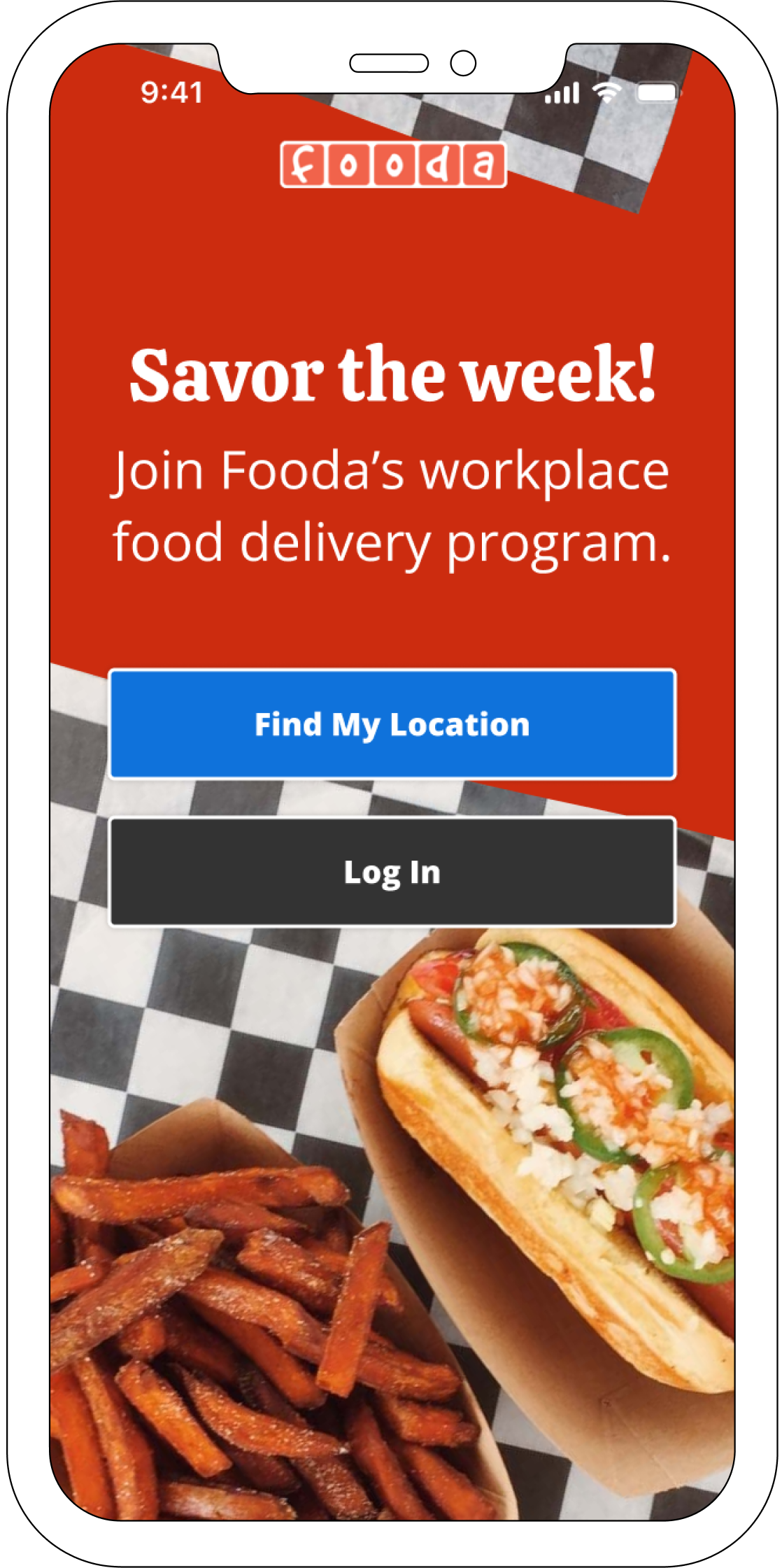
Splash
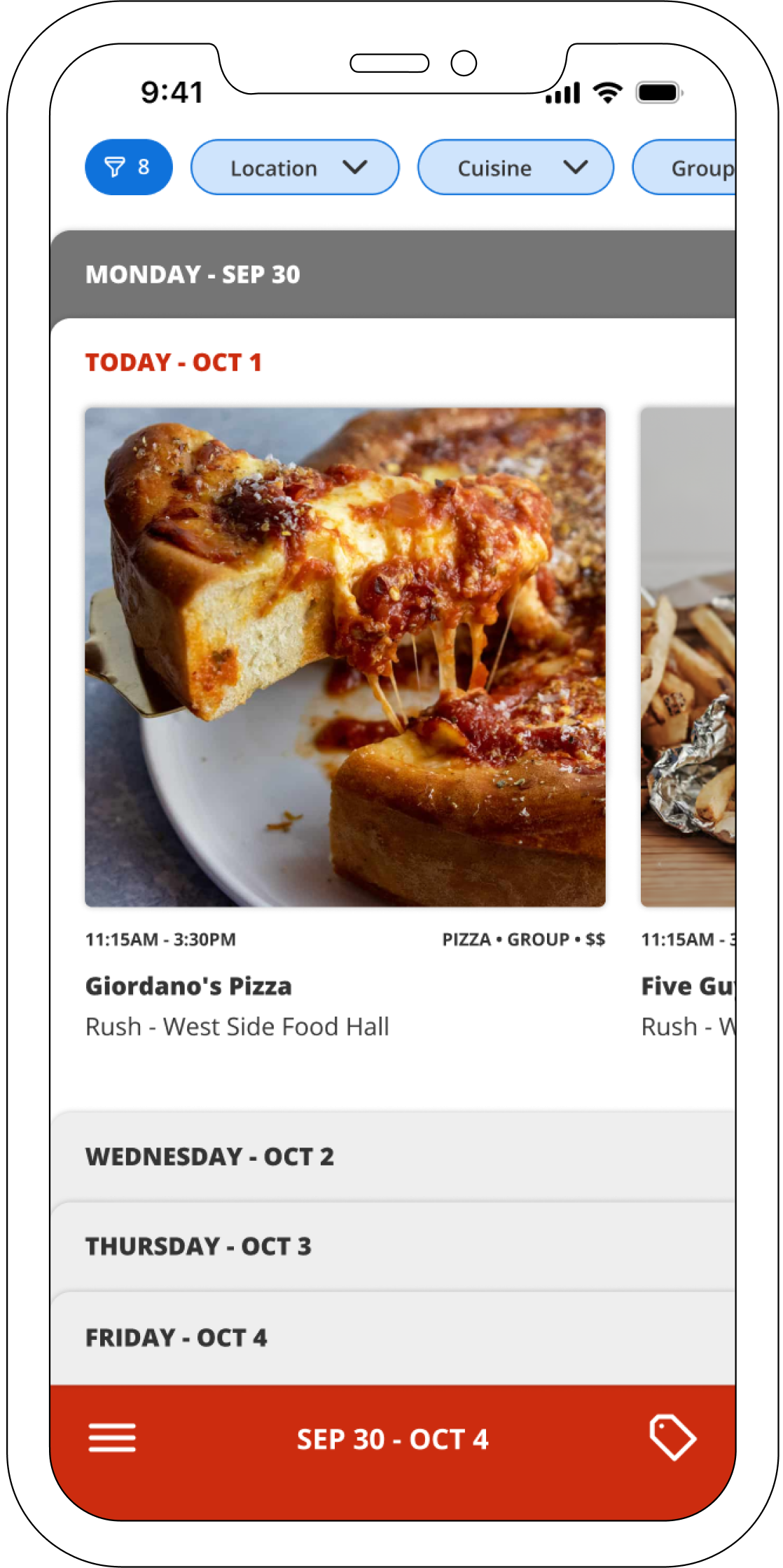
Accordion - Today
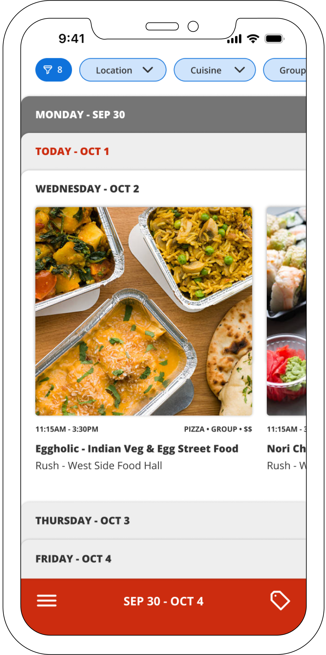
Accordion - Tomorrow
Stream Design:
The design update integrates all weekly restaurant offerings into a user-friendly stream. No more hassle—simply scroll through each day without the need to navigate to the top of the screen to switch days.
The design update integrates all weekly restaurant offerings into a user-friendly stream. No more hassle—simply scroll through each day without the need to navigate to the top of the screen to switch days.
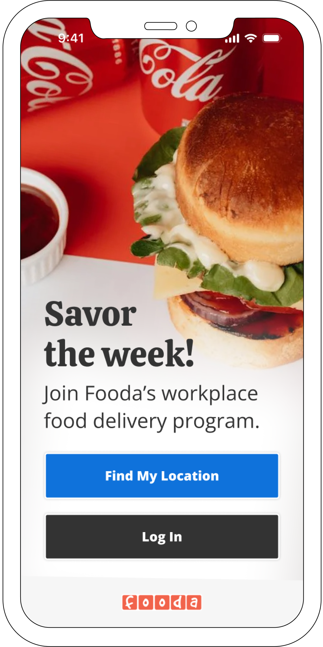
Splash
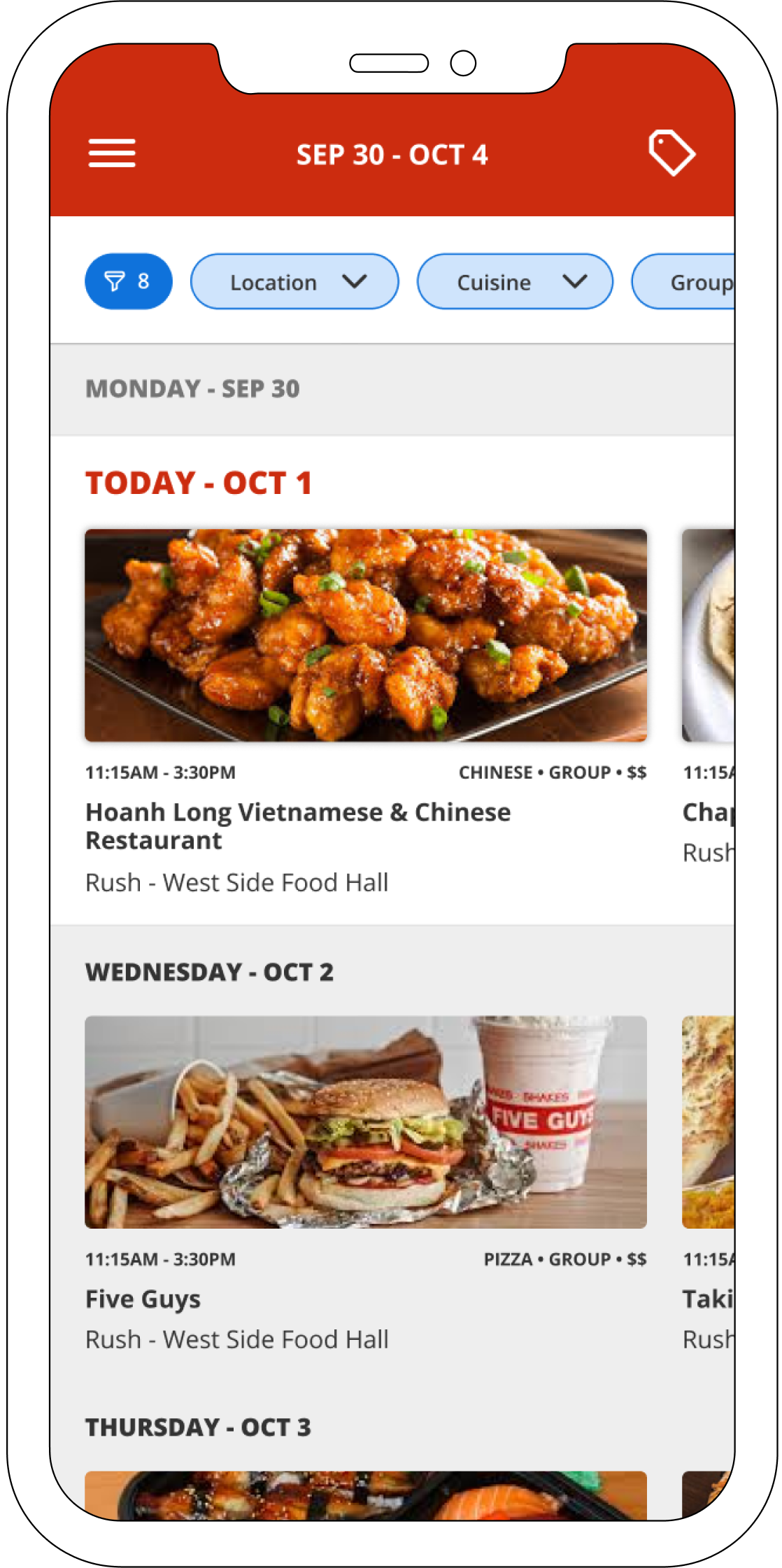
Scroll
Enhanced Navigation for Seamless Planning and Rewards:
With all restaurants accessible in one continuous stream, planning meals for the week becomes a breeze.
With all restaurants accessible in one continuous stream, planning meals for the week becomes a breeze.
Restaurants that partake in the Fooda Rewards Program will display an icon at the top of the weekly offerings screen. This allows users to see if they have a reward available (applied as a discount to meals), or view whether the restaurant is part of the program.
Group Ordering Made Effortless:
The group ordering feature allows users to filter restaurants by those that support group orders.
The group ordering feature allows users to filter restaurants by those that support group orders.
A simple, sharable link on the restaurant screen provides bundled order capabilities. Just share the link, and the order can be paid for by the sharing individual–perfect for managers or small teams.